Having relevant content is crucial to the success of any website devoted to earning money… but that’s not the only thing that matters. If your visitors can't find your content (or your ads) because they're having issues navigating your site, then that's a problem.
Sloppy layout? Links that don't lead anywhere? That's one surefire way to torment and frustrate your users.
These annoying situations are not only frustrating, they’re down right inexcusable! They’re rookie mistakes, plain and simple.
Situations like these CAN be prevented and WILL impact your traffic in the long run if not dealt with. Web design has never been more important for this reason alone and should always take into account the rules of web ergonomics.
These rules were developed after a long tradition of enigmatic psychological theories... but, fear not! In this series, we're going to translate them for you by including a few simple guidelines that you can use as a checklist to make sure that your website dazzles, while staying true to the ergonomic principles.
The Gestalt Principles of Perception
These principles explain how the human brain processes visual stimuli. The main idea here is that our brain automatically simplifies the images that the eye catches with these few rules:
The Law of Good Gestalt
The unified whole is different from the sum of the parts.
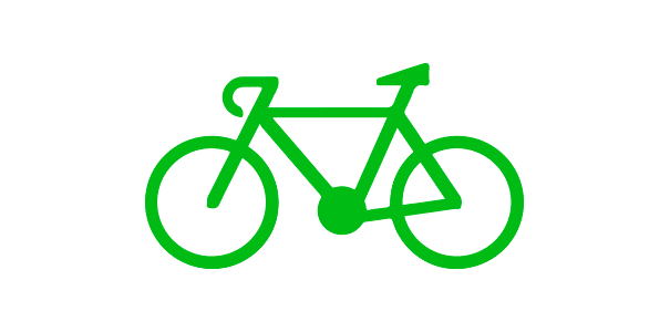
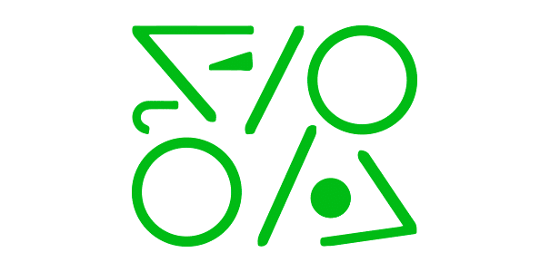
It’s basic gestalt law. We always simplify the shape of an image, according to this law. In the example below, your eye wants to see a bicycle, so it sees this rather than a slew of obscure shapes and symbols. Therefore, make sure that your images, especially your brand logo, are visually simple, easy on the eyes, and easily understood and identifiable.
GOOD
FAIL
The Law of Proximity
We subconsciously give the same meaning to elements or data that we observe to be physically close. On a website, the same type of content, or any related buttons, should be grouped together in a way that makes sense.
GOOD
FAIL
In this example, the radio buttons are too close together, creating potential confusion as to which one corresponds to each credit card:

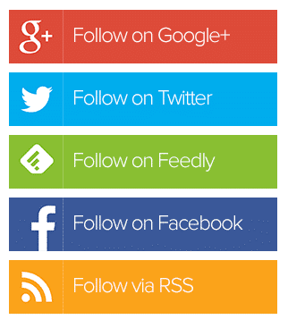
The Law of Similarity
This law says that our brain has a tendency to regroup similar shapes and to give them the same meaning when they look alike according to their size, shape, color, content or behavior. So, make sure that all of your clicking areas look the same.
Fitts Law
The bigger and closer a target is, the easier it is to reach! This seems like an easy rule to catch, but do your ad zones take this into account? (i.e., are the ads close enough together to maximize their profitability?) In other words, don’t be afraid to enlarge your clicking areas to match the full size of your ads. If you wanna go further on the subject, check out our best tips how to reach your banner’s full potential.
The Affordance Concept
The affordance of an object refers to the series of clues that make us believe that we can interact with it. In terms of a website, it refers to the things that look like clickable areas: Images, text of a different color, the shape of the pointer, its localization, etc.
More often than we think, Internet users click on things that don’t link anywhere; this can cause a great deal of frustration as well as a sense of lost time, and income!
7 - Miller’s Magic Number
Memory is a faculty that forgets! With short-term memory, a person is only able to remember 7 items (more or less 2) at a time. Therefore, the average memory span is of 5 to 9 elements. Keep that in mind when you design your menus and pick-lists !
Hick’s Law
Making a choice can be time-consuming. The tedious calculus of Hick demonstrate the relation between the time that the brain takes to select an option and the number of options and their complexity.
In web ergonomics, let’s just say that keeping it simple is your best choice. Offer less options of better quality if you want your internet user to stay on your site… and buy your products. It’s proven that the more time you spend on a website desperately looking for something, the more likely you’ll be to just run away from it and try to find it somewhere else.
To make a long story short
This week, we broke down the good ol’ psychology theories related to web ergonomics. Hopefully you can follow these as guidance to approach your website with fresh new eyes.
In Part 2, we dive even deeper into web ergonomics. Readability and web conventions, anyone? Continue reading HERE.